With a growing number of fonts to choose from in your print and design projects, how can one decide what font to choose. Some fonts are better for print material and others can be used to give your signage more visible and easy to process .We have looked into the use of different fonts and come up with five that are most effective in our experience. All fonts can be divided into two categories, Serif and San Serif.
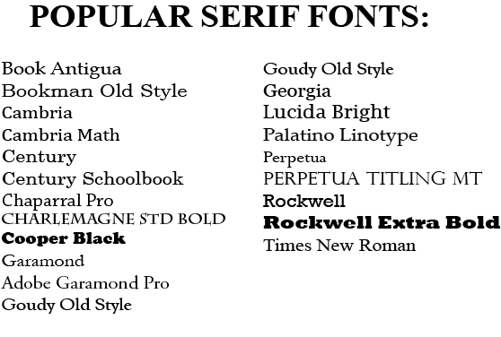
Serif Fonts.
As shown in the picture on the left, in typography a serif is a small line added to the end of the stroke of each letter and or number. Serif fonts are mostly used for the body of the articles or print materials as it is widely believed that these fonts are easy to read due there legibility. These fonts are widely used in books magazines and long print matters.
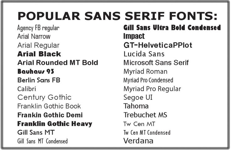
San Serif Fonts
San Serif is the form of typography that does not have the small lines projecting called serifs at the end of the strokes. This type of typography is mostly used for headings in print. San Serif fonts are getting more popular for display of text on computer screens. This is because computer screens use lower resolution digital displays, fine details like Serifs may disappear or appear too large.
Top Five Fonts
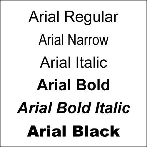
Arial.
The most simplest font that is very versatile in nature. When it comes to signage Arial black is the best font to use. It is wide enough to display the message that can be visible from far and also simple enough for molding channel letters. If right colors are used the sign normally is visible from a distance.
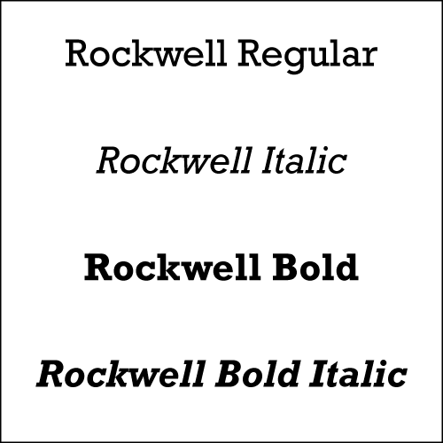
Rockwell
From the serif family Rockwell is a majestic font that can be used for headings and for body. Rockwell because of its mono weighted stroke is primarily used in displaying lengthy bodies of text. Rockwell adds personality to any design and is robust enough to break it apart and work with it in your projects.
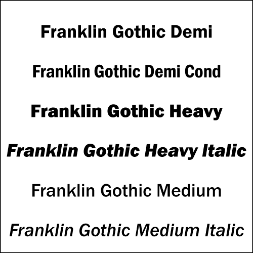
Franklin Gothic
Franklin Gothic is a bold, expressive, eye catching and confident font. Since it is a heavy and visually bold font, it works best with more subtle fonts. It can cause quite an effect in your projects when used in conjunction with lighter typefaces.
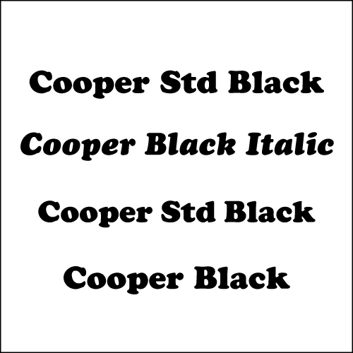
Cooper
When you want to emphasize any idea, write it in cooper typeface. The rounded corners of each letter show a bold and confident typeface that demands respect. Best for headings and in the signs where you probably will have the width but height constraints.
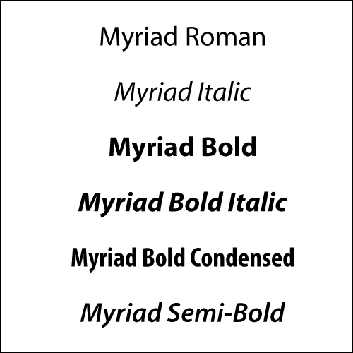
Myriad.
Another font from the San Serif family is Myriad. This is an elegant font which is very close in looks to Arial but with a little higher detail to its letters. It is great when used in print or signage as it provides many options and style to choose from. The typeface is highly legible and when used in signage can provide the edge that anyone would be looking for.